The vibrant colours of the Ikea and Raw Color Tesammans collection
Cover The vibrant colours of the Ikea and Raw Color Tesammans collection

Ikea's new collaboration with Raw Colour features joyful coloured homeware

Much like the “feel good” hormone it is named after, dopamine decor is a design trend that gives you a sense of pleasure and motivation.

A subdivision of maximalism, dopamine decor takes it a step further from the “more is more” aesthetic. Instead of a specific design aesthetic or daring interiors, it’s as simple as creating spaces that not only capture your personality and style but also evoke feelings of happiness and joy, sometimes even bringing back nostalgic childhood memories.

The antithesis of beige-hued decor that has been evolving since the latter half of the 20th century in the 1980s, it’s no wonder that dopamine decor is a big advocate of colours—the more invigorating and whimsical the palette, the better.

Read more: 5 decor brands to explore maximalism for your home in 2024

Tatler Asia
Christoph Brach and Daniera ter Haar of Eindhoven-based design studio Raw Color
Above Christoph Brach and Daniera ter Haar of Eindhoven-based design studio Raw Color
Tatler Asia
Creating unique connections between colours, materials and shapes
Above Creating unique connections between colours, materials and shapes

“I encourage people to use colour to remind them of special people and places… colours that correlate to your stories, [and] make memories a more tangible experience in your home,” says Old Brand New interior designer Dabito to Real Simple.

“We believe that colour is a very powerful visual tool. It is something that we humans perceive very quickly, and can have beneficial effects on our well-being and for our surroundings,” comments Daniera ter Haar and Christoph Brach of the Dutch design duo Raw Color, in light of their recent collaboration with Ikea for the vibrant Tesammans collection that is centred around the transformative nature of colour.
See also: 6 most unique Ikea stores around the world

Tatler Asia
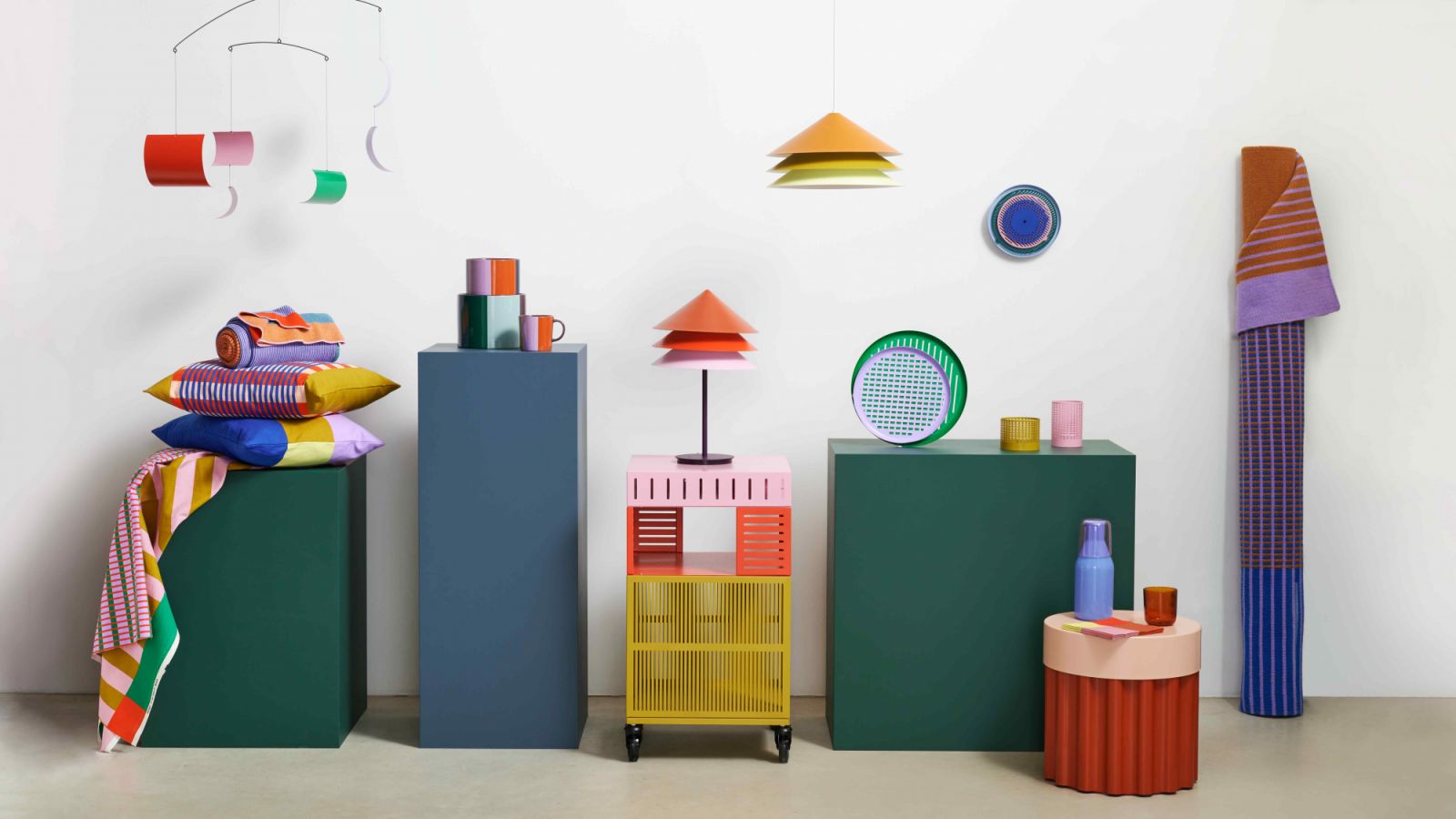
Designed to highlight how colour can transform everyday objects
Above Designed to highlight how colour can transform everyday objects
Tatler Asia
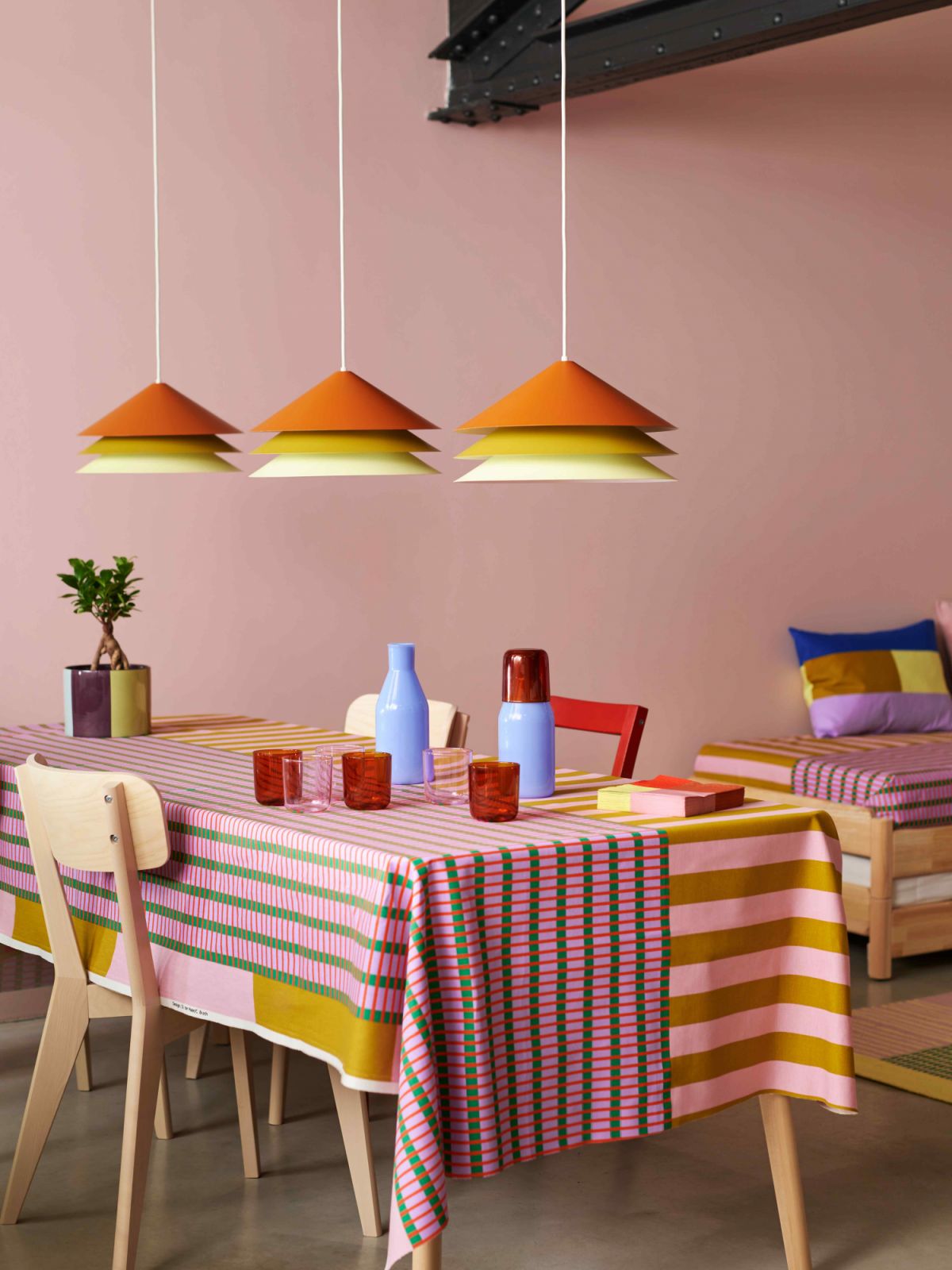
An impactful and coordinated look with tones and patterns
Above An impactful and coordinated look with tones and patterns

Drawing inspiration from Raw Color’s distinct design language, on top of their ability to create unique connections between colours, materials and shapes, the 18-piece collection is designed to highlight how colour can transform everyday objects, while inspiring more people to discover its positive emotional effects.

“We have taken an experimental approach to try different combinations of shades and materials, playing with shapes that catch light in certain ways and by mixing bright, saturated tones with more muted ones,” explains ter Haar.

Don't miss: Home tour: Inside Rosanna Ocampo-Rodriguez’s colourful family abode

Tatler Asia
Dopamine decor is mixing bright, saturated tones with more muted ones
Above Dopamine decor is mixing bright, saturated tones with more muted ones
Tatler Asia
Graphic lines and solid colours of the Ikea Tesammans knitted throw
Above Graphic lines and solid colours of the Ikea Tesammans knitted throw

The collection includes a knitted throw with graphic lines and solid colours that while from a distance it seemingly blends into a single hue, it is the coming together of separate colours up close.

While on the other hand, the lampshades with a stacked design transitions from dark to lighter tones, creating different reflections as they catch light.

Read more: Ikea’s new Nytillverkad collection: A stylish classic design revival

Tatler Asia
A stacked design transitions from dark to lighter tones
Above A stacked design transitions from dark to lighter tones
Tatler Asia
The Ikea Tesammans lampshade in its vibrant element
Above The Ikea Tesammans lampshade in its vibrant element

Raw Color’s vibrant palette and graphic lines also marry Ikea’s expertise in creating functional standout pieces.

The eye-catching abstract wall clock is a constantly changing work of art that blends decorative art with engineering, with the green, pink and blue circles moving to show the hours, minutes and seconds.

Whereas, the storage unit on castors “is very functional as you can access it from different sides, and move it around easily,” the duo elaborates. 

“When you walk around it, the grids create a moiré effect–a visual phenomenon where overlapping patterns create a new, wavy pattern, showcasing the dynamic interaction between colours, form, and movement.”

See also: Home tour: A whimsical Kuala Lumpur apartment with colourful details

arrow left arrow left
arrow right arrow right
Photo 1 of 2 The Ikea Tesammans wall clock is also a moving art piece
Photo 2 of 2 Green, pink and blue circles shows the hours, minutes and seconds
Tatler Asia
Colour blocking grids that create a moiré effect
Above Colour blocking grids that create a moiré effect
Tatler Asia
The Ikea Tesammans storage unit with castors
Above The Ikea Tesammans storage unit with castors

“Colours are never alone, and it needs company [of other colours] to be what it is. A red next to a pink will look tonal, but when placed next to a blue, it will look brighter and more contrasting,” Brach adds. “It’s much like a recipe where finding the right balance is key for an object to truly sparkle,” he continues.

Aside from the interaction between the colours, the Tesammans collection—which translates as “together” or “in company” in Swedish—is also about the interaction of different objects

Many items in the collection are not alone: the pair of vases, tealight holders and the carafes and glasses… You can place them next to or on top of each other, and the visual expression changes.

Don't miss: Home tour: An art lover’s colourful dream apartment in New York

Tatler Asia
The Ikea Tesammans side table made of corrugated steel sheet
Above The Ikea Tesammans side table made of corrugated steel sheet
Tatler Asia
Finding the right balance for an object to truly sparkle
Above Finding the right balance for an object to truly sparkle

“It could be a challenge for a very outspoken palette; sometimes, people can be scared of using it, with white interiors becoming more default,” the design duo say. “But, we hope this collection can challenge people to apply some colour in their spaces, and in return, bring joy and a colourful character to somebody’s interior.”

“We believe colours could be a little beacon in a home, and bring some positivity to people’s homes,” they conclude.

The Ikea and Raw Color Tesammans collection will be available from April 11 onwards across all Ikea stores worldwide.

NOW READ

6 maximalist interior designers to follow on Instagram

Home Tour: An eclectic and colourful condominium in Kuala Lumpur

6 popular Ikea products and what makes them iconic

Credits

Photography  

Ikea

Topics